Apartment Homepage UX Improvement
Designed and implemented custom homepage sections to better communicate key selling points and guide prospective renters through the leasing journey — turning a generic page into a compelling, scannable experience.
Overview
The Problem
The homepage lacked clear structure for communicating key value propositions, making it difficult for prospective renters to quickly understand what sets the community apart and what actions they should take next.
Generic apartment homepages tend to lead with photos and basic info — but fail to tell a story or give users a reason to choose this community over others. I designed and built a series of custom sections that gave the page a clear narrative arc: here's why this place is special, here's what you get, here's the neighborhood, here's how to take action.
- Built within an existing platform and component system
- Limited flexibility in layout and styling
- Needed to incorporate specific marketing content provided by the client
Design Decisions
The Sections
Each section was designed to serve a specific purpose in the user journey — moving prospective renters from awareness to action through a clear, scannable narrative.
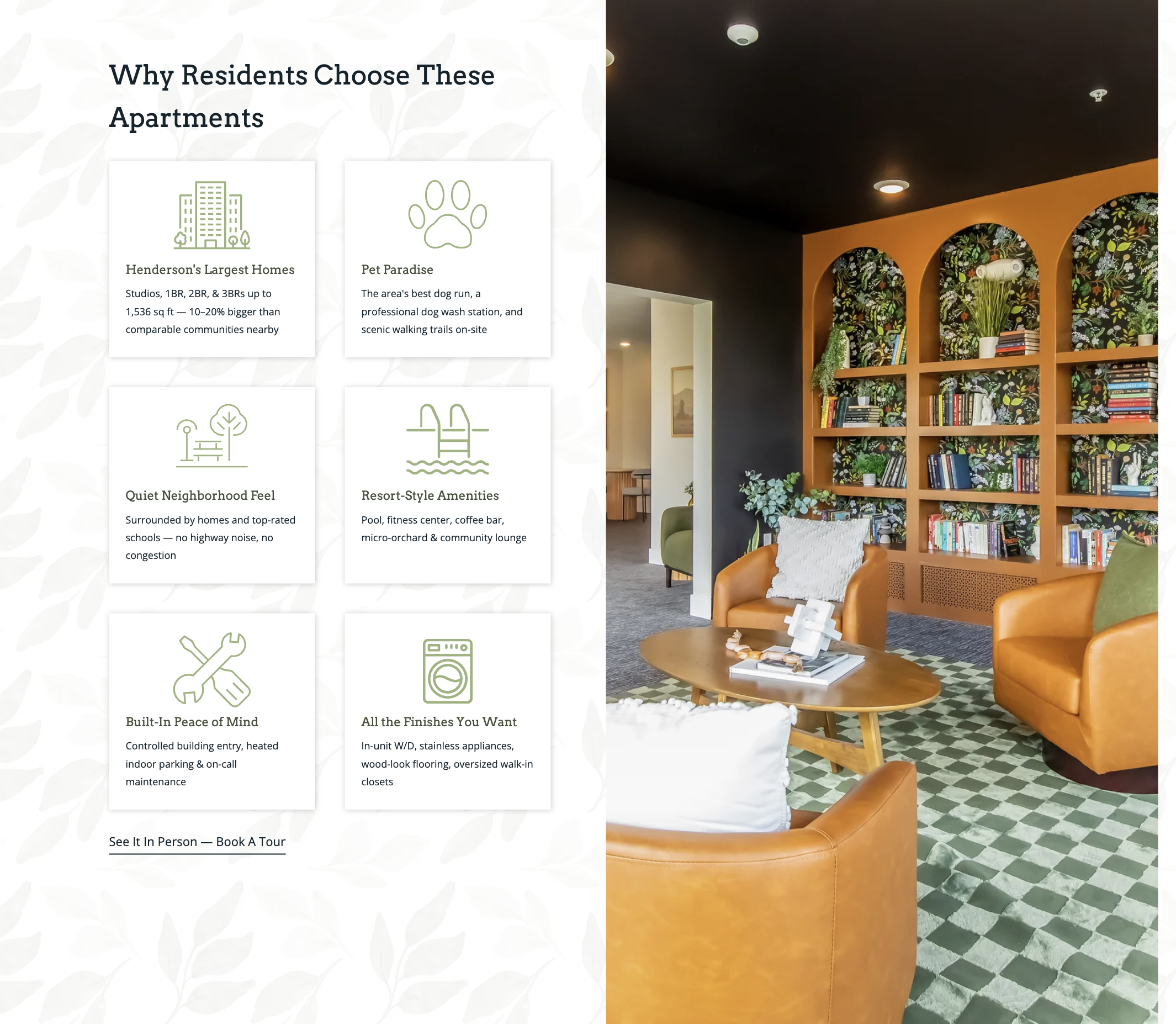
Benefits Grid
The homepage previously had no structured way to communicate the community's primary benefits. I introduced a split-layout section pairing a 2×3 benefits grid with a lifestyle photo — allowing users to quickly scan what makes this property worth considering without having to read large blocks of text. Each card pairs a custom icon with a headline and short description, keeping the cognitive load low while communicating a lot of information efficiently. The "See It In Person — Book A Tour" CTA at the bottom provides a natural next step.
Targeted Audience Section
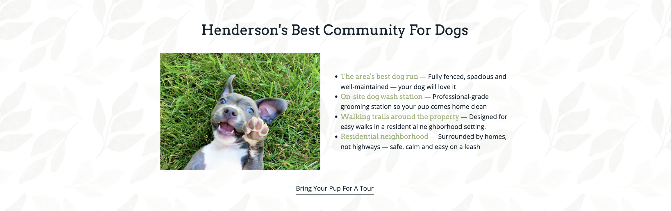
Pet owners are a key audience segment for this property and the original homepage did nothing to speak to them directly. I structured the provided content into a dedicated section that leads with an engaging photo, highlights specific pet-friendly features with clear benefit-focused copy, and ends with a targeted CTA — "Bring Your Pup For A Tour." Calling out this audience explicitly makes the content feel relevant and personal rather than generic.
Amenities Grid

Rather than listing amenities in a plain text block, I grouped them into a structured two-column grid with icons — reducing cognitive load and making it much easier for users to quickly scan and assess whether the property meets their needs. The "Everything You Need" headline frames the list as a promise rather than a feature dump, which subtly shifts the tone toward benefit-first communication.
Neighborhood & Call to Action
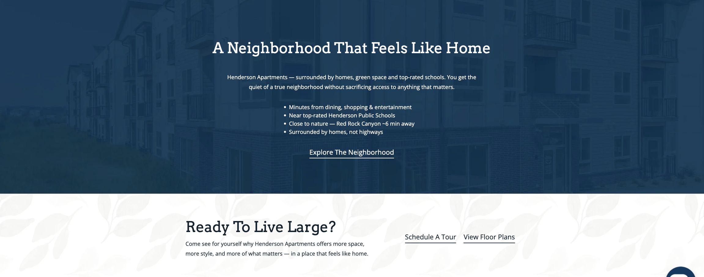
The neighborhood section uses a dark background with a subtle aerial photo to create visual contrast and signal a shift in content — this is about the area, not just the building. The closing "Ready To Live Large?" section provides dual CTAs (Schedule A Tour and View Floor Plans) that give users clear next steps depending on where they are in their decision process. Together these two sections complete the page's narrative arc and guide users toward conversion.
Final Outcome
A page that tells a story
The redesigned homepage transforms a generic property page into a structured, benefit-led experience. Each section serves a specific role in guiding prospective renters — from understanding why this community is special, to visualizing the lifestyle it offers, to taking action.
By structuring and prioritizing information thoughtfully, the final design improves scannability, highlights key value propositions, and guides users toward meaningful actions — all within the constraints of an existing platform and component system.